
Materials & finishes
Neutral fitted furniture
Neutral fitted furniture is designed to recede rather than assert itself, using warm off-whites and soft greys to blend into a wall or scheme rather than stand apart from it.
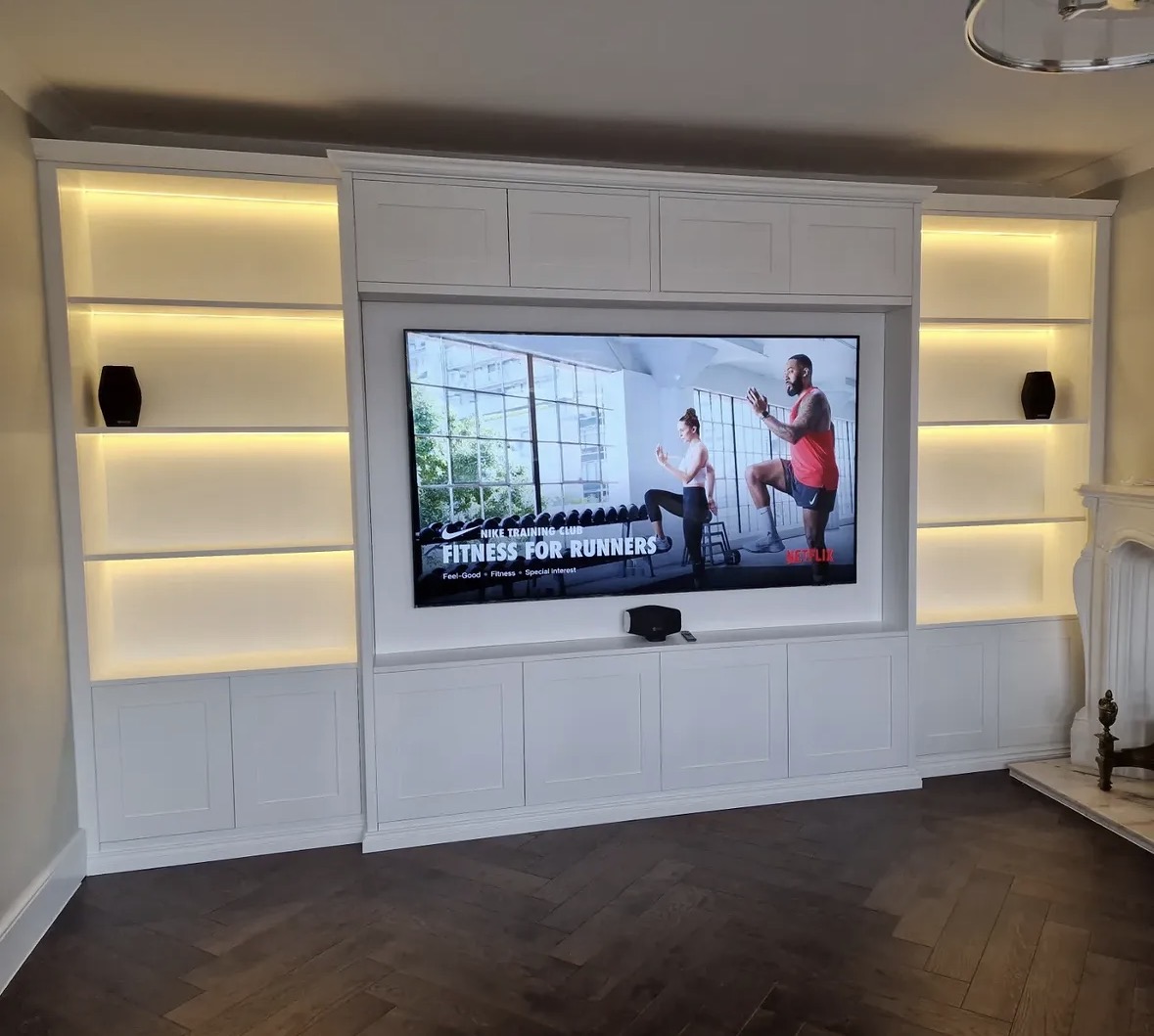
Neutral fitted furniture
Not every room benefits from a strong colour statement, and a significant number of Chester Thomas projects use a neutral palette deliberately, choosing warm off-whites, soft greys and muted tones that allow architecture, light and other materials in the room to take precedence. This is a considered design decision, not the absence of one.
Neutral does not mean plain. A well-judged neutral cabinetry colour still has warmth or coolness, still interacts with the light in a room across the day, and still needs to be matched carefully to the walls, flooring and hardware around it. The difference from a bolder colour is one of intention: a neutral scheme is designed to be calm and settled rather than a focal point in itself.
This approach suits fitted wardrobes and tall storage particularly well, where the goal is often for the furniture to read as part of the room's architecture, almost like a built wall of storage, rather than as a piece of furniture placed within it. The same principle applies to media walls, kitchens and home offices where a quieter, more architectural result is wanted.
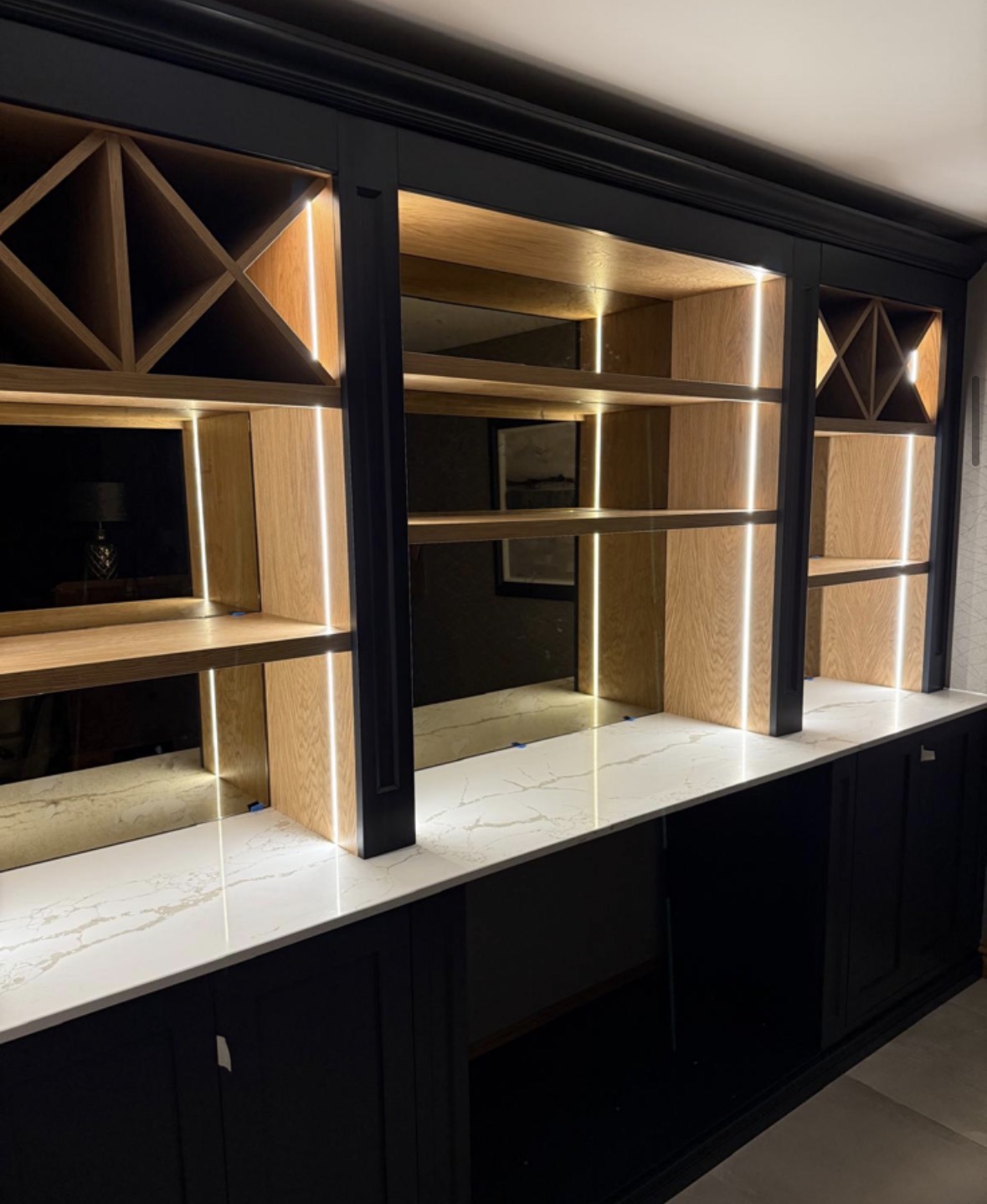
Neutral fitted furniture also tends to pair unusually well with timber and stone, since a restrained cabinetry colour allows the grain of a timber shelf or the veining of a stone surface to remain the most visually interesting element in the room, rather than competing with a strong cabinetry colour for attention.
Getting a neutral scheme right takes more care than it might first appear, precisely because there is no bold colour to hide behind. A neutral that is slightly too warm, too cool, or a shade too dark can unsettle an otherwise carefully designed room, whereas a well-judged neutral simply feels correct without drawing comment. For this reason, neutral colour decisions at Chester Thomas are tested against sample boards and the room's actual light before being confirmed, rather than agreed from a swatch alone, and the same door style and hardware choices that apply to any painted piece, shaker or flat panel, brass or brushed metal, are considered alongside the colour itself.
Where neutral fitted furniture works well
01
Fitted wardrobes and dressing rooms
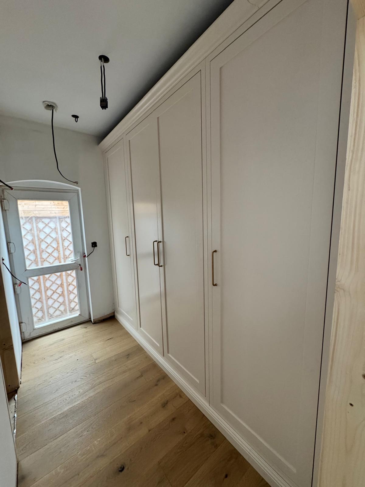
A soft grey or warm off-white wardrobe front allows fitted storage to read as part of the room's architecture rather than as a standalone piece, particularly where flush skirting and minimal visible junctions are used to carry the wall colour straight into the cabinetry.
02
Tall storage and boot rooms
Grey painted boot rooms and tall storage runs handle daily use well while keeping a hallway or utility space feeling calm rather than cluttered, an important consideration in rooms that see coats, boots and bags passing through several times a day.
03
Media walls
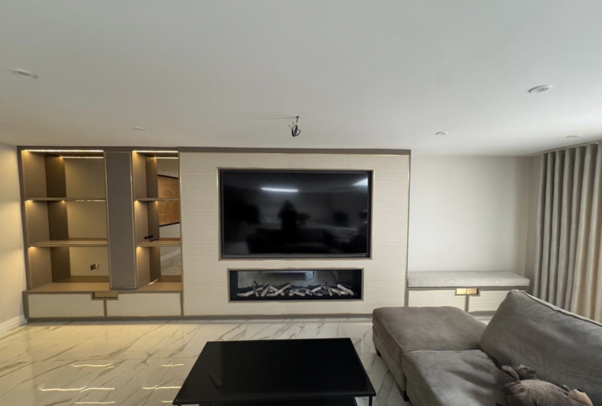
An ivory or pale neutral media wall keeps a living space feeling light and architectural, letting artwork, soft furnishings or a fireplace remain the visual focus.
04
Home offices
Neutral tones in a working space support concentration by keeping the room visually quiet, an approach discussed further on home offices & studies.
05
Kitchens within open-plan spaces
In an open-plan kitchen, dining and living area, a neutral kitchen colour helps the cabinetry sit comfortably alongside furniture and finishes it was not necessarily designed to match exactly, reducing the risk of the kitchen looking visually separate from the rest of the space.
06
Alcove and display cabinetry
Neutral alcove units allow objects, books or artwork displayed within them to stand out, rather than competing with a strongly coloured backdrop.
Warmth versus coolness in a neutral tone
Neutral colours are rarely truly neutral once seen in a room; most lean slightly warm or slightly cool, and this lean has a significant effect on how the finished furniture reads under different lighting. A warm off-white will feel considerably different under cool downlighting than a soft grey with a cooler undertone, so this is tested against the room's actual lighting before a final colour is confirmed.
Blending furniture into architecture
A key aim of many neutral schemes is to have fitted furniture read as part of the wall rather than a piece of furniture applied to it. This is achieved through colour matching between cabinetry and adjoining walls, as well as through detailing such as flush skirting and minimal visible junctions, so the eye reads the whole surface as continuous.
Contrast with timber and stone
Neutral cabinetry is frequently paired with a timber or stone element, such as a shelf, worktop or feature panel, allowing that material's natural texture and grain to provide the visual interest that a stronger cabinetry colour might otherwise compete with. This pairing is considered during design rather than added afterward.
Where a stronger colour might work better
A neutral scheme is not always the right answer, and rooms with strong natural light, generous scale or a desire for a clear focal point sometimes suit a bolder painted colour instead, as covered on bespoke painted cabinetry and bespoke dark cabinetry. Part of the design conversation is establishing honestly whether a neutral or a stronger colour better serves the brief.
Coordinating across an open-plan space
In open-plan rooms combining a kitchen with living or dining space, a neutral cabinetry colour is often chosen specifically because it needs to sit comfortably against furniture, flooring and finishes that were not all selected as part of a single coordinated scheme. This is discussed as part of the wider room brief rather than the kitchen in isolation.
From our work
What neutral fitted furniture is typically paired with
- Timber shelving or worktops
- A neutral cabinetry colour against a timber shelf or worktop lets the timber grain provide warmth and visual interest.
- Stone surfaces
- Pale or veined stone surfaces sit comfortably against neutral cabinetry, with the stone itself fabricated by an appropriate specialist trade.
- Brushed or matt metal hardware
- Softer metal finishes, such as brushed nickel or bronze, complement a neutral scheme without introducing strong contrast.
- Fabric and soft furnishings
- In living spaces, neutral fitted furniture allows fabric, rugs and soft furnishings to carry more of a room's colour and pattern.
- Architectural detailing
- Flush skirting, shadow gaps and minimal hardware are often used alongside neutral colour to help furniture read as part of the room's architecture.
Design, manufacture, installation
Neutral colour decisions are tested against a room's actual light during design and specification, part of the sequence described on the process page, before manufacture in the Derbyshire workshop begins.
Questions we are asked
Colour & finish
- What counts as a neutral colour for fitted furniture?
- Neutral covers a range of warm off-whites, soft greys and muted tones that sit quietly within a room rather than drawing attention to themselves. It is not a single fixed colour, and the right neutral for a given room depends on its light, existing materials and the character the client wants.
- Will a neutral colour look the same in every room?
- No. Most neutral colours lean slightly warm or slightly cool, and this becomes far more noticeable once applied to a full run of cabinetry under a room's actual lighting. This is why neutral colours are tested against the room itself rather than chosen from a chart alone.
Design
- Does neutral fitted furniture look plain?
- A well-judged neutral scheme is considered rather than plain, and often relies on detailing such as flush skirting or a contrasting timber or stone element to give the piece interest without introducing a strong colour. The aim is calm rather than absence of design.
Rooms
- Is neutral fitted furniture suitable for wardrobes?
- It is one of the most common approaches for fitted wardrobes and dressing rooms, where a soft grey or off-white front helps the storage read as part of the room's architecture. More on wardrobe design is set out on fitted wardrobes and walk-in wardrobes.
- Can neutral cabinetry work in a kitchen?
- It works particularly well in open-plan spaces, where the kitchen needs to sit comfortably alongside living and dining furniture that was not all chosen as part of a single scheme. A neutral colour tends to coordinate more easily across a mixed set of materials than a bold one.
Design
- How does neutral fitted furniture pair with timber?
- Neutral cabinetry is frequently paired with a timber shelf, worktop or feature panel, allowing the timber's natural grain and warmth to provide visual interest that a stronger cabinetry colour would otherwise compete with. This pairing is considered during the design stage.
- When would a bolder colour work better than neutral?
- Rooms with strong natural light, generous proportions or a desire for a clear focal point sometimes suit a bolder painted colour instead, as discussed on bespoke painted cabinetry and bespoke dark cabinetry. Part of the design conversation is being honest about whether neutral genuinely suits the brief.
Colour & finish
- Does neutral fitted furniture still need to be colour matched?
- Neutral colours still need to be matched carefully to the walls, flooring and hardware in a room, and finishes can be developed to coordinate with an existing scheme in the same way as a bolder colour would be. More detail is set out on colour-matched bespoke furniture.
Rooms
- Can neutral fitted furniture be used for a media wall?
- It can, and an ivory or pale neutral media wall keeps a living space feeling light and architectural, letting a fireplace, artwork or soft furnishings remain the visual focus rather than competing with a strongly coloured backdrop. Integrated storage, shelving and cable management are all considered as part of the same design, and wider media wall design is covered in full on media walls.
- Is a boot room in a neutral colour practical?
- Grey painted boot rooms are a common and practical choice, striking a balance between a calm, coordinated look and a finish that copes reasonably well with the daily wear a boot room experiences. Practical performance is discussed as part of the wider specification for the room.
Design
- How is furniture made to blend into a wall rather than stand apart from it?
- This is usually achieved through close colour matching between cabinetry and the adjoining wall, along with detailing such as flush skirting and minimal visible junctions between panels, so the eye reads the surface as continuous rather than as a separate object placed against it.
Rooms
- Does neutral fitted furniture suit a home office?
- It often does, since a visually quiet colour scheme supports concentration in a working space better than a strong contrasting colour would, and a neutral run of desking and storage tends to suit both a dedicated study and a shared or open-plan working area. Layout and storage needs are established first, with colour agreed alongside them, as described on home offices & studies.
Cost
- What does neutral fitted furniture cost compared with a bolder colour?
- Cost is driven mainly by the size, complexity and door style of the piece rather than the colour itself carrying a separate premium. The clearest way to receive a meaningful figure is to share the project through the contact page, so a response reflects the specifics of what is being asked for.
Manufacture
- Is neutral fitted furniture designed and made in the same way as any other piece?
- Neutral fitted furniture follows the same design, manufacture and installation sequence as any other Chester Thomas piece, described in full on the process page, with colour agreed early and tested against the room's actual lighting before it is confirmed for manufacture, in the same way as any painted or timber finish.
Relevant bespoke services
Fitted wardrobes
Neutral wardrobe fronts designed to blend into a bedroom's architecture.
Walk-in wardrobes
Neutral dressing room cabinetry and layout.
Media walls
Ivory and pale neutral media wall design.
Home offices
Neutral office cabinetry designed for a quiet, focused space.
Bespoke cabinetry
General cabinetry design across neutral and stronger colours.
Alcove units
Neutral alcove cabinetry designed to showcase objects and display.
Related materials and styles
Colour-matched furniture
Coordinating painted cabinetry with the paint references, walls and woodwork already established in a room.
Painted cabinetry
Hand-painted cabinetry in shaker and flat-panel styles, designed to sit correctly within the room it furnishes.
Floating cabinetry
Wall-mounted television units, display shelving and storage, designed to appear to float clear of the floor.
Mirrored cabinetry
Mirrored doors, antique mirror bar backs and lit mirrored shelving, designed to add depth and reflected light.
To discuss materials and finishes, call Chester Thomas on +44 7418 627358, email info@chesterthomas.com or start your project.
Planning Something Bespoke?
Tell us about your space, what you're looking to create and where the project is located.