
Materials & finishes
Colour-matched bespoke furniture
Colour-matched furniture is less about the paint itself and more about how a piece is coordinated with everything already decided around it, from wall colour to existing woodwork and hardware.
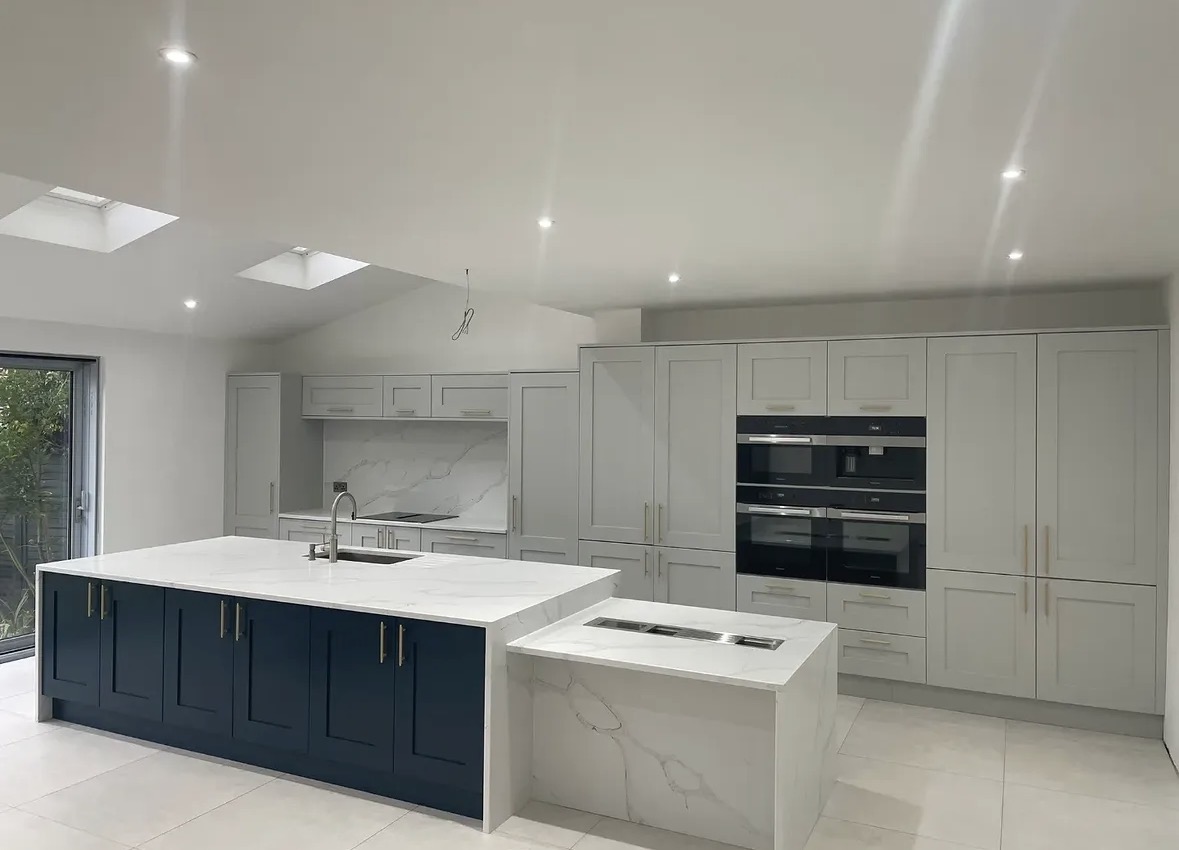
Colour-matched furniture
Most bespoke furniture is not designed in isolation. A kitchen, wardrobe or media wall sits within a room that already has walls, skirting, flooring and often other joinery in place, and the colour chosen for a new piece is judged against all of it, not against a paint chart on its own. Colour-matched furniture is the process of arriving at that judgement deliberately, rather than leaving it to chance.
This is a different question to the one addressed on bespoke painted cabinetry, which covers painted finishes as a material choice, door style and detailing. Here, the focus is coordination: how a specific colour reference is agreed, tested and carried consistently across a piece of furniture and, where relevant, across more than one room of a house.
The starting point is usually a reference the client already has to hand, whether that is a paint tin, a swatch from a decorator, or a colour already used on walls or woodwork elsewhere in the property. This reference becomes the anchor for the cabinetry colour discussion, and finishes can be developed to coordinate with it, though the closeness of the eventual match depends on the reference itself and the surface being finished.
Colour matching is relevant across a wide range of furniture types, from kitchens and wardrobes to media cabinetry and fitted offices, and the same coordinated approach applies whether a single room is being furnished or several rooms are being brought into line with one another across a whole project.
The process is deliberately front-loaded. A reference is gathered, tested and reviewed before manufacture begins, rather than adjusted afterward, because a painted cabinetry run is far harder to alter once it is finished than a sample is to revise. This is why the colour conversation is treated as part of design and specification rather than a late-stage finishing decision, and why samples are reviewed within the room itself wherever that is practical.
Where colour matching matters most
01
Kitchens against existing joinery
Where a kitchen is being added to a house with existing painted woodwork, matching the new cabinetry to that woodwork keeps the whole ground floor reading as one considered scheme.
02
Wardrobes within a decorated bedroom
Fitted wardrobes are often the last piece to go in after a bedroom has already been decorated, so the wardrobe colour is matched to walls already painted rather than the other way round.
03
Media cabinetry against a feature wall
A media wall or cabinet run positioned against a painted feature wall needs its colour judged carefully, since even a close but imperfect match can read as an error rather than a design choice.
04
Multi-room projects
Where a project spans several rooms, a shared colour reference can be carried through kitchen, boot room and office cabinetry, giving the house a consistent thread of colour and detail.
05
Working with an interior designer's palette
Where an interior designer has already set a palette for a project, cabinetry colour is coordinated against that palette from the outset rather than introduced as a separate decision.
06
Replacing or extending existing furniture
Where new cabinetry is being added alongside furniture we have made previously, the existing colour reference is used as the starting point for the new piece.
Working from a paint reference
A specific paint reference, whether a tin, a code or a physical sample, gives the colour discussion a clear starting point. Finishes can be developed to coordinate with the wider interior scheme using this reference, though it is worth noting that a painted surface on cabinetry doors will not always read identically to the same colour on a wall, since sheen, light and the surface itself all affect how a colour appears.
Where no reference exists yet, the conversation usually starts from the room's existing materials, such as flooring, stone or hardware, and works outward from there toward a colour that suits the space as a whole.
Matching walls and woodwork
Cabinetry colour is judged in the context of the walls and woodwork around it rather than in isolation. A colour that reads correctly on a swatch can look quite different once it covers a large cabinetry run under a room's actual lighting, so samples are considered within the room itself wherever possible before a final decision is confirmed.
Coordinating across rooms
On projects covering more than one room, a single colour reference is sometimes carried across kitchen, wardrobe and office cabinetry to give the house a consistent character, while door style and hardware vary to suit each room. Where rooms call for genuinely different colours, the aim instead becomes a family of tones that sit comfortably together rather than a single repeated colour.
Where a perfect match is not guaranteed
We do not present cabinetry as capable of matching every paint manufacturer's colour perfectly in every instance, since results depend on the reference supplied, the surface being finished and the lighting in the room. What can be offered is a considered, close coordination developed and reviewed with the client before it is confirmed, so any difference is understood and accepted before manufacture proceeds.
Coordinating hardware and detailing
Hardware, whether brass, black or a more neutral finish, is chosen alongside the colour match itself, since it affects how warm or cool the finished piece reads against the surrounding scheme. This is agreed as part of the same specification conversation rather than treated as a separate decision made later, since changing hardware after a colour has been confirmed can shift how warm or cool that colour appears.
Timing the colour decision within a project
Colour matching works best once the surrounding scheme, or at least a firm direction for it, is settled, since the reference a cabinetry colour is matched against needs to exist or be agreed before a sample can be developed. Where decorating and cabinetry manufacture are happening in parallel, this is planned early so the two are not working from different assumptions about the finished colour.
From our work
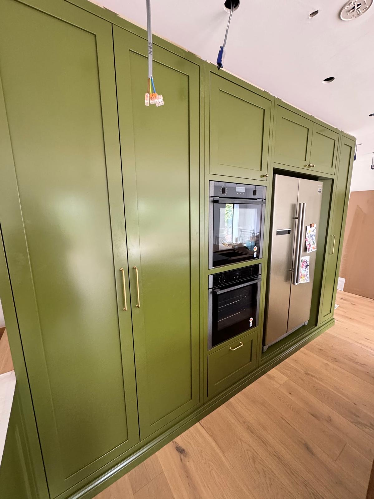
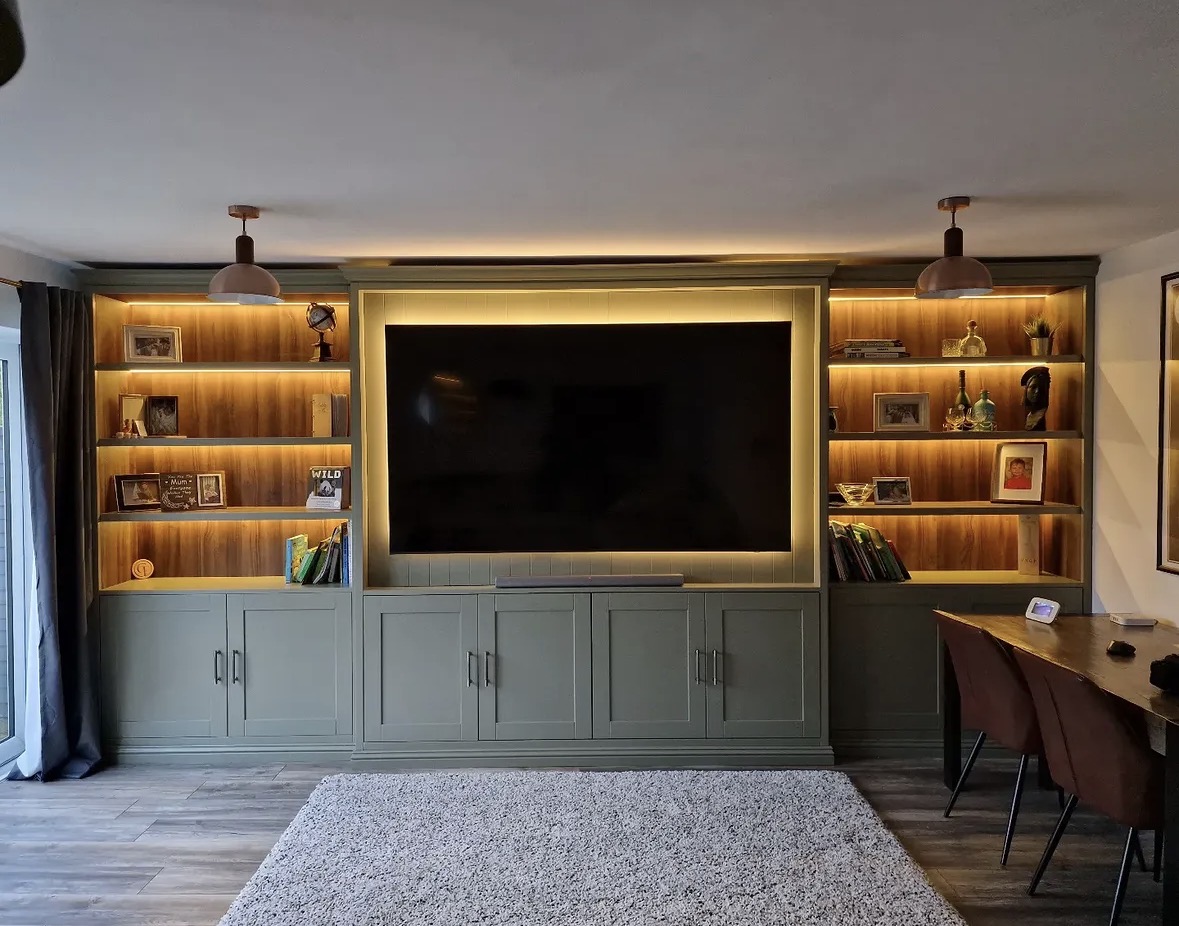
What colour-matched furniture is typically paired with
- Existing wall colour
- The most common pairing is a cabinetry colour matched directly to a wall already painted or about to be painted in the same room.
- Existing woodwork
- Skirting, architrave and door frames already in a property are a frequent reference point, particularly in period houses with established painted joinery.
- Stone and worktop tones
- Cabinetry colour is often chosen to sit comfortably against a stone worktop or surface, with fabrication of the stone itself carried out by the appropriate specialist trade.
- Hardware finish
- Brass, black or nickel hardware is selected to complement the matched colour, adding warmth or restraint depending on the scheme.
- A designer's material board
- Where an interior designer has prepared a material and colour board for a project, cabinetry is matched against it directly during specification.
Design, manufacture, installation
Colour matching is agreed during design and specification, as described on the process page, with samples reviewed before manufacture begins so the final result is confirmed rather than assumed.
Questions we are asked
Process
- How do I give Chester Thomas a colour to match?
- The most useful starting point is a physical reference, such as a paint tin, a swatch, or an existing painted surface in the room. This gives the colour discussion something concrete to work from, and finishes can be developed to coordinate with it, though the final result is reviewed with you before manufacture proceeds.
Colour & finish
- Can you match any paint brand exactly?
- We work from the reference provided and aim for a close, considered match, but we do not claim every manufacturer's colour can be reproduced perfectly on cabinetry in every case. Sheen, surface and lighting all affect how a colour reads, and any difference is discussed openly before the finish is confirmed.
- Will a wall colour look the same on cabinetry?
- Not necessarily. A colour that reads correctly on a painted wall can appear different on a cabinetry door, since the surface, sheen and the amount of light hitting a vertical run of doors are all different to a wall. This is why samples are considered against the room itself wherever possible before a final decision is made.
Design
- Can furniture in different rooms be matched to each other?
- It can, and where a project spans several rooms, a single colour reference is often carried across kitchen, wardrobe and office cabinetry, with door style and hardware varied to suit each space. Where truly different colours are wanted, we instead aim for a family of tones that sit comfortably together.
Process
- What if I don't have a specific paint reference yet?
- That is common, and the conversation can start from the room's existing materials instead, such as flooring, stone or hardware already chosen. From there a colour direction is developed and refined until a specific reference is agreed, rather than the decision being forced before the rest of the scheme is settled.
Working together
- Do you work with an interior designer's colour board?
- Where a designer has already established a palette or material board for a project, cabinetry colour is coordinated against it during specification rather than treated as a separate decision made independently. The designer is kept involved in reviewing the sample once it is developed, so the finished colour is agreed by everyone working on the room before it goes to manufacture, and any adjustment can be made while it is still straightforward to do so.
Design
- Is colour matching only relevant to kitchens?
- No. Wardrobes, media cabinetry, home offices and library furniture are all matched to their surrounding scheme in the same way, and the process is the same regardless of which room the piece is destined for. A wardrobe matched to a decorated bedroom wall, or a media cabinet matched to a painted feature wall, calls for exactly the same reference-gathering and sample review as a kitchen, since the risk of an obvious mismatch is just as real in any room with an existing colour scheme.
Process
- How is a colour match confirmed before manufacture?
- A sample is developed from the agreed reference and reviewed, ideally within the room itself under its actual lighting, before the colour is confirmed for manufacture. This step exists specifically to catch any difference between the reference and the painted result before it becomes a finished piece.
- Can existing furniture be used as the colour reference for a new piece?
- Where new cabinetry is being added alongside furniture already made by Chester Thomas or another maker, the existing piece is often used as the starting reference for the new colour, so the two sit together convincingly rather than reading as two separate decisions. This is particularly useful when extending a kitchen or adding a matching piece to a room some years after the original was fitted, since a physical sample of the existing colour is more reliable than trying to describe it from memory.
Colour & finish
- Does the sheen of the paint affect the match?
- It does. The same colour reference can look noticeably different depending on whether the sheen is matt, satin or a higher gloss, and sheen is discussed as part of the colour conversation alongside the reference itself, since it changes how the finished cabinetry reads in the room.
- Can hardware be matched to a colour scheme as well?
- Hardware finish is chosen alongside the colour match, since brass, black or nickel all change how warm or cool a matched colour reads. This is agreed as part of the same specification conversation rather than decided separately once the cabinetry colour is fixed.
Process
- What happens if the match isn't quite right once it's made?
- This is exactly why a sample is reviewed before manufacture proceeds, so any adjustment is made at that stage rather than after a full run of cabinetry has been finished. Reviewing samples in the actual room, under its real lighting, is the most reliable way to avoid a surprise later.
Cost
- Is colour matching more expensive than a standard painted finish?
- Cost depends on the piece itself, the finish and the sampling involved, rather than colour matching being a separate fixed extra in every case. The most useful next step is to share the project and the colour reference through the contact page, so a response can be given against the specifics.
Chester Thomas
- Does Chester Thomas design furniture as well as match colour?
- Colour matching sits within our wider design service, alongside layout, storage and door style, rather than as a standalone offering that can be commissioned on its own. The furniture itself is designed, manufactured and installed by the same Derbyshire team throughout, as described on the process page, so the person agreeing a colour reference with you is working from the same drawings and specification as everyone building the piece.
Cost
- How much does colour-matched furniture cost?
- Colour matching itself is part of the design and specification stage rather than a separate line item, so cost is driven by the piece being made, not by the fact that its colour is being matched. The clearest way to get a meaningful figure is to send the project and, where possible, the colour reference through the contact page, so a response can reflect what is actually being asked for.
Relevant bespoke services
Painted kitchens
Painted kitchen cabinetry coordinated with a wider colour scheme.
Fitted wardrobes
Wardrobe colour matched to an already decorated bedroom.
Media walls
Media cabinetry matched against feature walls and existing decor.
Home offices
Office cabinetry coordinated with an existing room scheme.
Bespoke cabinetry
General cabinetry design incorporating a matched colour.
Related materials and styles
Painted cabinetry
Hand-painted cabinetry in shaker and flat-panel styles, designed to sit correctly within the room it furnishes.
Dark cabinetry
Deep painted tones and dark stained timber, used with lighting and contrast considered from the outset.
Neutral fitted furniture
Warm neutrals and soft greys, designed to sit quietly within a room rather than compete with it.
To discuss materials and finishes, call Chester Thomas on +44 7418 627358, email info@chesterthomas.com or start your project.
Planning Something Bespoke?
Tell us about your space, what you're looking to create and where the project is located.